Below is a mockup of my fantasy next-generation London underground on-platform display, which would not only show you exactly where incoming trains were on the line (and update their progress in real time), but also which carriages were more or less crowded (achieved by sensing passenger body heat or possibly carriage weight, to account for all those suitcases). That way, you could increase your chances of boarding and the platform announcers wouldn't have to keep telling new arrivals to move along the platform.
Go on TfL/CBS Outdoor - you've already got the screens...
Showing posts with label design. Show all posts
Showing posts with label design. Show all posts
Friday, December 16, 2011
Next-gen London underground display
Saturday, August 23, 2008
The devil in the detail: small but significant interface touches
They say that God / the devil is in the details and, when it comes to user interface design, I think they may just be right. The difference between a functional but uninspiring product and a product which is a joy to use is so often in the smallest, sometime almost imperceptible, touches - something which Apple understands only too well and has built much of its recent success on. Below are five example of tiny interfaces touches which make all the difference in the user experience of a product. Anyone got any other favourites?
Dynamic iCal icon![]()
This definitely falls into the 'so subtle you might miss it' category. So used was I to the dumb/static icons of the Windows desktop that I initially failed to notice that the Calendar icon on my iPhone was updating every day to show the correct date. Such a simple thing but once I'd spotted it, I no longer had to open the app to check the current date - a real time-saver. I then spotted that the same functionality was present in the iCal dock icon in Leopard (but not, alas, in previous versions of OS X). Microsoft take note.
iPhone real-world physics
The discrete application of real-world physics to the iPhone interface is one of the things which makes it such a joy to use; pages bounce, icons wobble, emails fold up and disappear into the trash can. It's the visual design equivalent of haptic technology (e.g. force feedback) which reassures the users that their actions are having an effect on the objects they're interacting with; something the PC desktop has historically been so terrible at (e.g. "I think I clicked on it but nothing seems to be happening. I'll click on it again. Oh shit, now two of the things have opened...")
Blippr 'characters remaining' progress bar
The 'characters remaining' countdown is, in and of itself, a neat interface innovation and has now become a standard on mobile phones and microblogging services. However, it is Blippr's visual representation of this by means of a lowly progress bar which recently caught my eye on the basis that it's easier for the brain to absorb this information in peripheral vision when it's visually represented.
Wisia image suggest from Google Images
The thing that impressed me most about new Q&A service Wisia was not the wisdom of their particular crowd (who seem about as wise as most internet communities do in aggregate - i.e. not very), but the feature which automatically pulls in images from Google Image Search for you to associate with your answer. They offer the same functionality when choosing your profile picture so, in my instance, my avatar was automatically suggested as one of the top Google Image results for my chosen username (fabricoffolly).
TripSay profile completion ranking
Incentivising users to complete profile information is a perennial challenge for site owners keen to glean as much demographic data as possible. Many opt for a progress bar which reassures users they're nearly done, others promise greater functionality for those with completed profiles. TripSay has come up with a simple but ingenious approach to this problem which is to show your profile completion status relative to other users (i.e. as a ranking), informing me that "8360 people have rated more places than you" and tempting me to rate more with the knowledge that I could "Rate just one more place to advance to #7810".
Friday, July 25, 2008
Innovative online shopping interfaces
Ever since the dot com bubble burst all over Miss Boo in the early noughties, online retailers have tended to steer clear of innovative interfaces in favour of a no-nonsense Amazon-style approach (browse categories, search, scan product description/images/reviews, add to shopping basket - you know the drill). However the advent of Web 2.0 and its associated technologies has encouraged developers to start pushing the envelope again in this area. Below is a round-up of some of the more innovative interfaces currently out there. Have you stumbled across others? Add them in the comments below.
Zoomii
http://zoomii.com
Billing itself as the "real" online bookstore, Zoomii Books attempts to emulate the experience of browsing shelves in a bricks and mortar retailer, presenting book covers on virtual shelves and linking through to Amazon for those all important affiliate dollars.
BrowseGoods
http://browsegoods.com
Also piggy-packing on Amazon's extensive inventory, BrowseGoods gives you a floor plan view of a virtual department store and enables you to zoom in on departments Google Maps-style until you reach individual items.
Kinset
http://www.kinset.com
The next step on from Zoomii and BrowseGoods, Kinset provides a fully immersive 3D shopping experience. Currently requires a download (PC only), although a Flash version is flagged as 'Coming Soon'.
Etsy
http://www.etsy.com
Not new but still great; in addition to pioneering a new online market sector (everything handmade), Etsy also boasts a a number of interface innovations such as browsing by colour, time or location.
Like.com
http://www.like.com
Like.com invites visitors to "shop visually" with the aid of a 'detail search' and colour, shape and pattern matching tools.
Panic Goods
http://www.panic.com/goods
Panic is a Mac software developer with a nice sideline in designer tees. The apparel store employs a simple drag and drop mechanic for adding items to your shopping cart which makes me want to buy more t-shirts (not that I really need any encouragement).
KnickerPicker
http://www.knickerpicker.com
KnickerPicker's Dressing Room takes the multiple product photos of rival sites like figleaves.com to the next level by providing interactive video of the garments being worn by a model who most closely resembles your bodyshape. Your chosen model saunters from stage right in black lingerie and heels, ready to 'come closer', 'walk back' or 'turn around'. May just attract some male visitors not necessarily looking to make a purchase methinks...
limitedCargo
http://www.limitedcargo.com
A cross between Startup Schwag and The Million Dollar Homepage, limitedCargo offers a numbered, limited edition run of a single product from a brand partner. Buy one and you get a square on the product page to upload an image and a link.
HEMA
http://producten.hema.nl
Not strictly speaking a shopping interface, Dutch department store HEMA deserves a mention for it's domino effect product page. That Honda Accord ad has a lot to answer for...
Monday, July 07, 2008
A visual history of the evolution of video game controllers
It was whilst researching a separate piece on trends in gaming (to follow) that I got sidetracked by the evolution of video game controllers. Thanks to Wikipedia, Flickr and a host of diligently maintained fan-sites, I was able to piece together the below pictorial history of how gaming input devices have evolved over the years. It's far from comprehensive; instead it aims to capture the seminal products which were truly game-changing, either by delivering genuine innovation or by taking an innovation mainstream.
(Also viewable as a presentation on SlideShare)
PDP-1 / Spacewar! (1960)
Photo: Marcin Wichary
Galaxy Game (1971)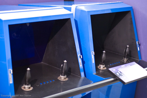
Photo: Nik Clayton
Magnavox Odyssey (1972)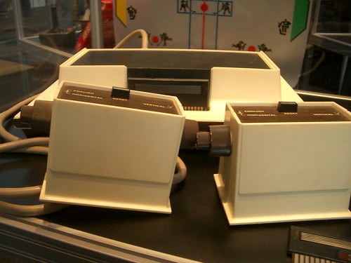
Photo: Thomas Becker
Atari 2600 Joystick (1977)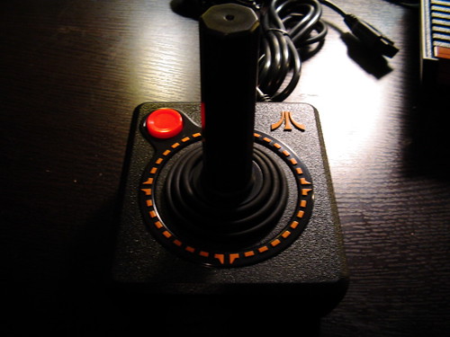
Photo: Bill Bradford
Intellivision (1979)
Photo: Brandy Shaul
Atari Football Trakball (1979)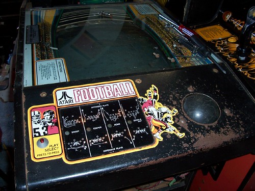
Photo: Steve Port
NES Controller (1983)
Photo: TenThirtyNine
NES Zapper (1984)
Photo: Pablo Noel
Nintendo Powerglove (1989)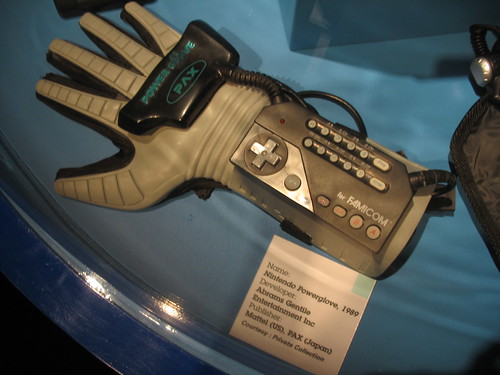
Photo: Peter M
N64 Controller (1996)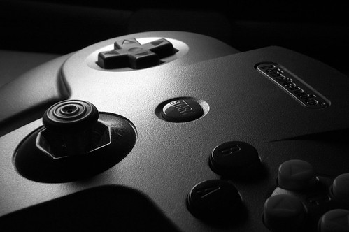
Photo: Jeffy Can
Dance Dance Revolution (1998)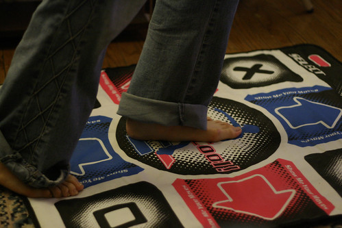
Photo: Richard Eriksson
EyeToy (2003)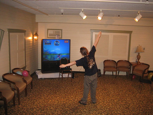
Photo: Charles Ulrich
Nintendo DS (2004)
Photo: Jo Carter
Buzz! (2005)
Photo: Damien du Toit
Guitar Hero (2005)
Photo: Hunter Wilson
Bodypad (2005)
Photo: Oncle Tom
Wiimote (2006)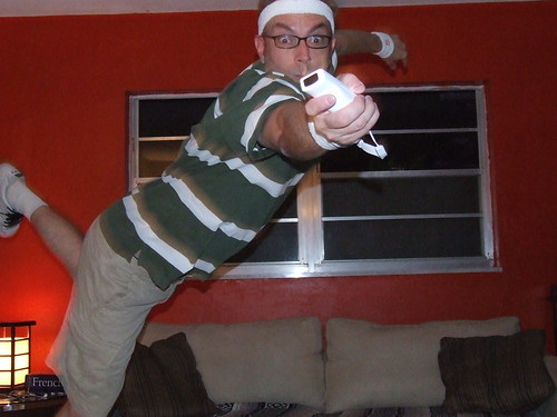
Photo: Greg Turner
Novint Falcon (2007)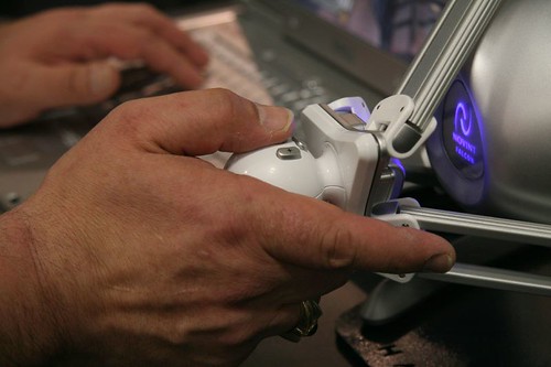
Photo: Jon Jordan
Wii Balance Board (2008)
Photo: Natalie Johnson
CamSpace (2008)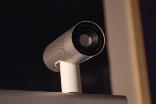
Photo: Scott F
Thursday, September 06, 2007
Joost, Babelgum & Apple TV in your browser
Want to get a taste of Joost/Babelgum/AppleTV (they do all sound quite edible) but don't have a beta invite/can't be bothered with the download/don't want to shell out £200? Well, you're in luck. Independent developer, Paul Yanez, has created browser-based Flash mashups of all three products and they're pretty damn slick (see below screengrabs). Whilst they don't feature the same video content as their parent apps, they do give a very good feel of the interfaces and the content they suck in from assorted video sharing sites is arguably more compelling than much of the official offers. Nice job, Mr Yanez.
Joost Flash Mashup
Babelgum Flash Mashup
Apple TV Mashup
Monday, July 30, 2007
TouchGraph Facebook Browser
Continuing the theme of interesting interfaces, check out the below screencap from TouchGraph Photos, a Java-based Facebook app which maps your friends and their relationships using coloured bubbles (and photos when your more zoomed in). It's similar to the popular Friend Wheel app (175,000 adds and counting) but with a slicker interface and a focus on navigating your friends' photos. They've employed the same interface in tools for exploring both Google and Amazon.
Saturday, March 31, 2007
Can brands own colours?
According to marketing lore, it was once possible for a single brand to 'own' a colour; Coca Cola owned red, IBM owned blue, UPS owned brown (or so the legend goes). Regardless of whether this was ever really the case, it certainly ain't true now. Our globalised, digital world has more brands, shouting more loudly, across more media, than ever before.
Not that all companies have given up on the dream of owning a colour globally. Vodafone still seems pretty set on wresting red from Coke's clutches (with some success according to Martin Lindstrom’s 2005 book Brand Sense, in which he claims 30% of UK consumers now associate red with Vodafone, compared with 22% for Coke). The fight for red has been further complicated by the entry of (PRODUCT)RED last year, which is hoping to own red across multiple sectors. That said, most companies have moved away from a goal of universal colour ownership and relocated the battle for colour supremacy to their own market sector.
Exhibit A is the 2005 legal dispute between Orange and easyGroup over the use of Pantone 151. Both companies had been using the distinctive shade of orange since the mid-90s, but it wasn't until Stelios announced the launch of the now-defunct easyMobile in 2004 that the mobile operator called in the lawyers; unsurprising when you consider that colour is the tacitly agreed brand differentiator amongst the mobile operators, where blue is synonymous with O2, magenta with T-Mobile, orange with, er, Orange and red with Vodafone (sorry Virgin). 3 opted out of the colour war by creating a chameleon logo, which employs different colours in different contexts.
Exhibit B is an Australian court action brought by Darrell Lea Chocolate Shops against confectionary giant Cadbury Schweppes last year. The judge found in favour of Darrell Lea concluding that "Cadbury does not own the colour purple and does not have an exclusive reputation in purple in connection with chocolate in Australia". Whilst Cadbury may have lost in court and been forced to amend the trademark claims on its packaging, it remains indelibly associated with purple in the minds of chocolate-loving consumers.
All of which is a precursor to asking whether it is possible to own a colour in the online space. My instinct is no - there are just too many competing brands. Strong colour/brand association is possible amongst UK mobile operators because there are only half a dozen of them. Likewise, cigarette companies successfully carved up the colours amongst them because there was a limited number of brands, enabling them to take out billboard ads or sponsor Formula One cars primarily on the strength of colour association (purple meant Silk Cut, gold meant Benson & Hedges, red meant Marlboro, black meant John Player Special).
However, the barriers to entry (and by extension, brand creation) on the web are so low that even in the same market sector, companies seem to have accepted the futility of attempting to own a single colour. The practicalities of web design may also feed into this; it's fine for Vodafone's full-page print ads and billboards to be almost entirely red, but that wouldn't work on its website (unless it was aiming to make its visitors' eyes bleed).
If ownership of a single colour is unattainable on the web, how about a particular combination of colours? Graham Beale got the ball rolling on this with a colour scheme montage posted on his blog, Hold and Modify. However, of the 15 represented, I could identify just 2 (Flickr and Blogger). Whilst Graham assures me that his fellow web designers were able to name many more, I think it's fair to infer that Joe Public wouldn't.
Interestingly, the one site which comes closest to achieving colour ownership on the web for me is lastminute.com which has had almost 10 years to stake its claim on a particularly aggressive shade of pink. Shown a swatch in isolation (or in a pink line-up with Smile and T-Mobile) I reckon I would be able to identify it, although that may just be the subliminal impact of their weekly newsletter in my inbox.
Whilst colour will undoubtedly remain a critical element of brand identity, both on and offline, I wonder if it's moving lower down in the mix as the marketplace becomes increasingly crowded and colour ownership is redefined as a pipe dream from a bygone era (the mythology is that Coke began its ownership of red in the 1950s by changing the colour of Santa's suit from green). The democratisation of branding, facilitated by the Internet, has blown the lid off the notion of colour exclusivity and marketing will need to become more sophisticated in response.
Wednesday, March 28, 2007
The favicon - your 256 pixel brand identity
Despite often being deprioritised (or forgotten about altogether) by web developers, the lowly favicon (a contraction of favourite icon) is becoming an increasingly important aspect of brand identity on the web.
Usually measuring just 16 by 16 pixels, favicons are the small logos that appear next to the website names in your browser's list of favourites/bookmarks. Chances are they are also displayed in your browser's address bar, before the URL of the site.
Another place you will see them is on the tabs of tabbed web browsers such as Opera. Mozilla Firefox, and Internet Explorer 7 which, collectively, now account for over a third of the browser market (according TheCounter.com).
The rise of Web 2.0 has also contributed to the favicon's higher profile as a growing number of social bookmarking sites, syndication tools and API-enabled mashups make use of favicons when linking to other sites. In particular, the increasing use of favicon-based buttons on blogs encouraging visitors to summit to del.icio.us, Digg, Furl, Reddit, Stumble, Technorati etc. (see AddThis).
So, how are web developers responding to the increased attention on the favicon? Representing your brand effectively in just 256 pixels is undoubtedly an enormous design challenge and four main approaches seem to have emerged:
1.) Attempting to replicate the site's logo in it's entirety
This approach stands or falls on the complexity of your site's logo, which clearly favours those companies who designed their logo with favicons in mind (e.g. Blogger  , del.ico.us
  , Digg
  ). Long-established brands which pre-date the web have more of a conundrum - should they attempt to shrink their existing brand down to 16 x 16 pixels (e.g. BBC
  , NPR
, NPR  ) or should they design a new logo with this new branding space in mind? Companies who have already successfully distilled their brands down to a simple image (e.g. Apple
  , Nike
  , Smile
  ) have a clear advantage in this area.
2.) Abstracting the initial letter(s) from your site brand
Championed by Amazon ( ), Google (
 ) and Yahoo! (
 ) this approach has become increasingly commonplace. The challenge here is to ensure your design treatment is distinct enough from all the other sites using the same letter, or in some cases, a different letter - compare Blogger () and easyJet (
 ). Amazon and Yahoo!'s favicons are particularly successful as they incorporate another brand element besides the font (an arrow and an exclamation mark, respectively).
3.) Creating a custom graphic which attempts to convey the site's USP
More in line with the design conventions of desktop icons, this approach sidesteps the challenges of representing your site brand, but introduces the equally daunting task of effectively conveying the site's purpose in just 256 pixels. More successful examples include Lego ( ) and Threadless (
 ).
).
4.) Creating an abstract image
The least common approach, its main advantage is that in a world dominated by reduced logos and initial letters, abstract images stand out by virtue of being different. The downside is that is that it swims against the tide of received wisdom regarding branding and the resulting images are often indistinct or unmemorable (see this site's favicon, which I really must do something about). Interestingly, Flickr recently abandoned the initial letter approach ( ) in favour of something more abstract (
 ).
).
Whichever approach you adopt, it's worth remembering that your favicon is your (potentially permanent) brand presence on the limited and valuable real estate of people's browsers and across the wider web. The cardinal sin of favicons is not having one at all, which just looks lazy. Not having a favicon is like not having a sign promoting your store ahead of the turn off from the main road, when all your competitors have one. Yes, visitors will still find your site via search engines and weblinks and some may bookmark it. But they won't have the visual reminder of your brand when they scan their bookmarks/tabs, deciding where to visit.
In spite of this, a surprising number of high-profile sites are currently without favicons. I was so disappointed by the absence of a favicon for Empire that I created one ( ) and emailed it to the developers who I'm pleased to see have since put it live.
So, what lies ahead for the humble favicon? Well, larger sizes (32 x 32 pixels is increasingly common) and alternative image formats both seem inevitable as does a growing prominence on the mobile platform. I'm hoping use of animated favicons don't become more widespread as gratuitous animation usually pisses people off.
To finish off, below is an A-Z montage of initial letter favicons. First person to name all 26 gets a Cadbury's Cream Egg (click through to Flickr to annotate).

Subscribe to:
Posts (Atom)
 Subscribe to RSS feed


